ampersand
Signum tironianum
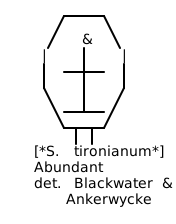
Description
A conjunction symbol descended from the Latin “et” ligature, now existing as an independent glyph with forms ranging from simple to ornamental. Distinguished by its ability to occupy single character space while performing the grammatical work of a three-letter word. Notable as one of the few symbols that appears in formal entity names, where it carries ceremonial weight beyond its conjunctive function.
Status
Abundant (with documented retreat from formal prose habitats).
Range
Abundant in commercial habitats (signage, branding, corporate nomenclature) and digital environments. Retreating from formal academic and legal prose, where house styles increasingly mandate spelled-out “and.” Persists in bibliographic citations between author names. Thrives in display typography and informal correspondence.
Call
Silent in speech, though occasionally expanded to “and” when text is read aloud. In recitation of firm names, sometimes pronounced with subtle emphasis that distinguishes it from the ordinary conjunction.
Sign
Varies dramatically across typefaces — from the simple & to elaborate specimens with pronounced flourishes. Track width typically exceeds standard letter spacing. Often kerned differently than alphabetic characters.
Easily Confused With
Most significantly with “and,” though the organisms perform identical grammatical work while occupying distinct registers. The ampersand signals formality in commercial names and antiquation in prose — register effects that “and” cannot achieve. Functionally, it provides space efficiency in constrained contexts. Readers sense but rarely articulate these register differences. Additionally confused with its own historical forms: the ornate Caslon or Garamond specimens in period documents often go unrecognized by readers habituated to simplified modern forms. This is one of few Signum species that experiences temporal confusion within its own lineage.